Initially I was asked to design only the bird characters for the five covers for this series. I gradually became involved in designing the internals and incorporating the characters in page. Such a fun and stress free project to work on.
The character brief was to use only indigenous birds from the Caribbean. It was a challenge to choose five very distinctive birds with very different looks and personalities.
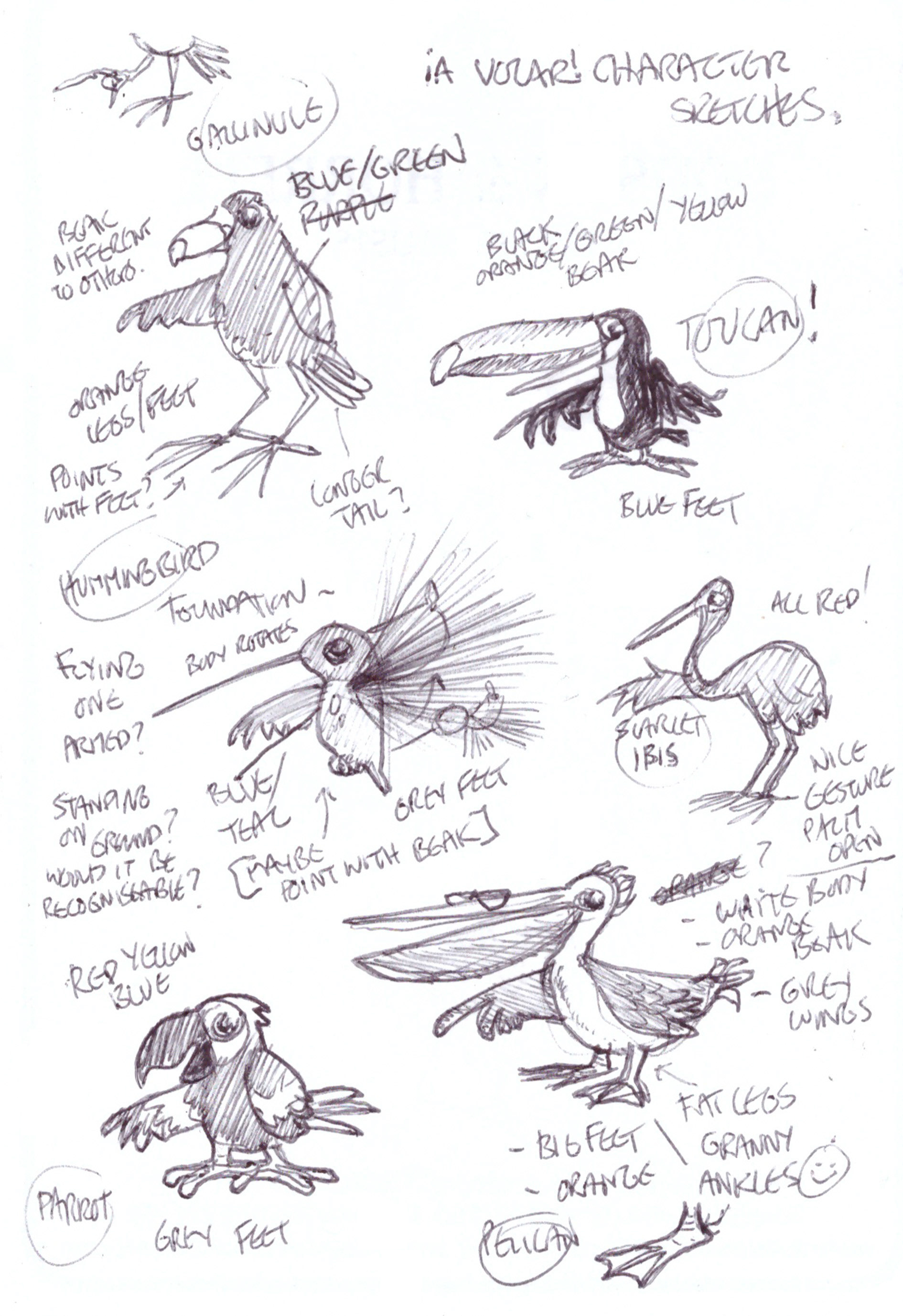
My first thumbnail had a Parrot, Hummingbird, Gallinule, Scarlet Ibis, Toucan and Pelican. At this early stage I started to realise that the Hummingbird may be a problem to design effectively with the beating wings. I also realised that I had one too many birds. Luckily for me as later the Hummingbird was dropped.
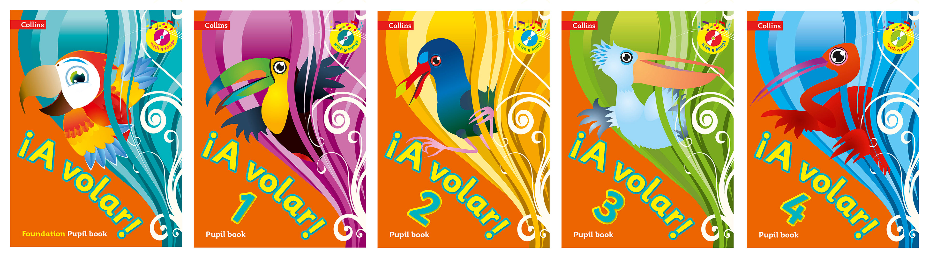
The following images show the characters in cover. The client wanted the covers to be split diagonally from top left to bottom right. The series 'orange' colour would take up the bottom left part of the cover with all text information in this area. I then had to come up with five year colours that wouldn't clash with the Series colour or, more importantly, the year characters. It was quite a struggle but I think they all work really well. The client are really happy with the final outcome and overall series design. I hope this leads to more of this kind of work.
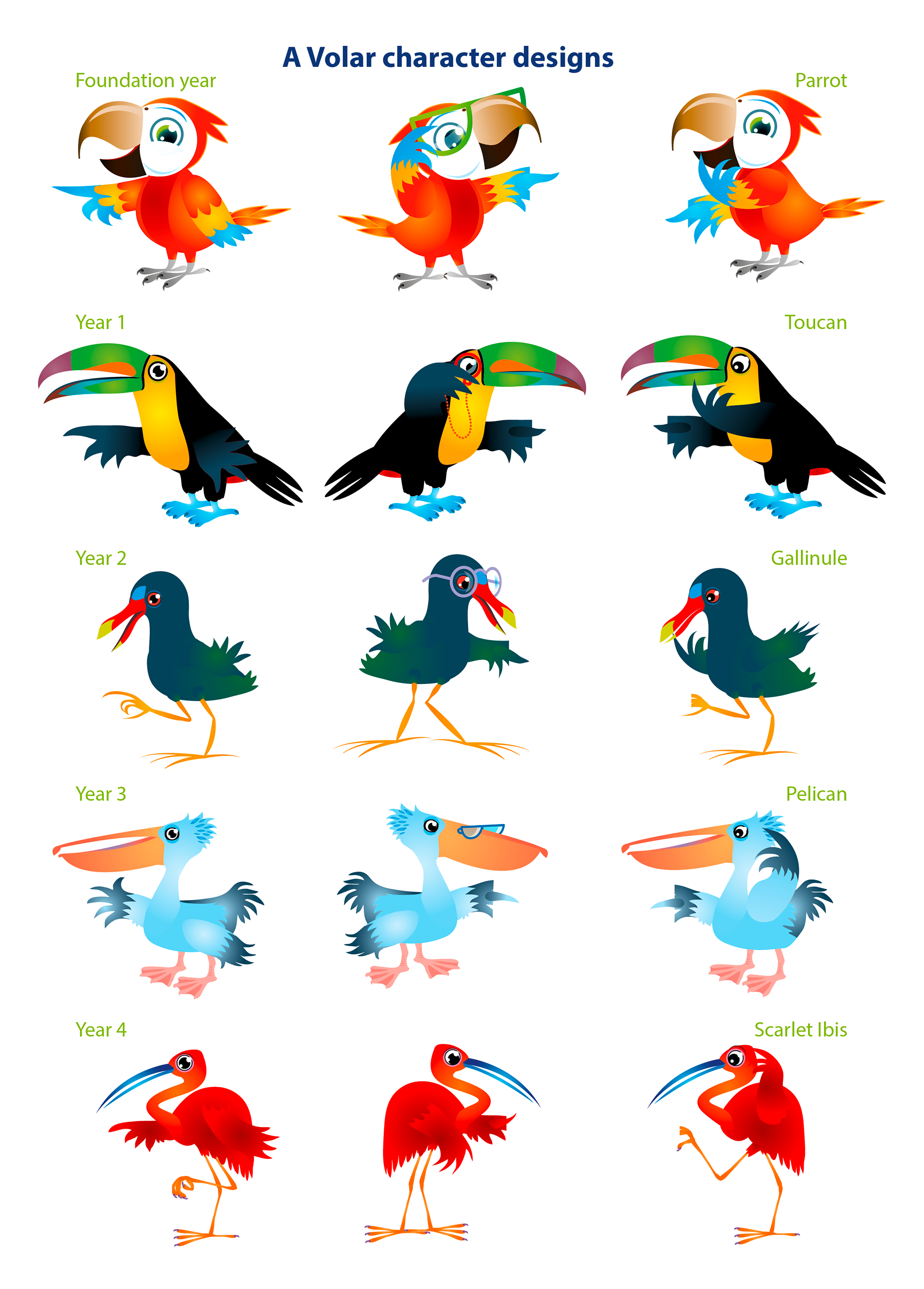
Also a character sheet to show a consistent character design across the series.
Internal page design.
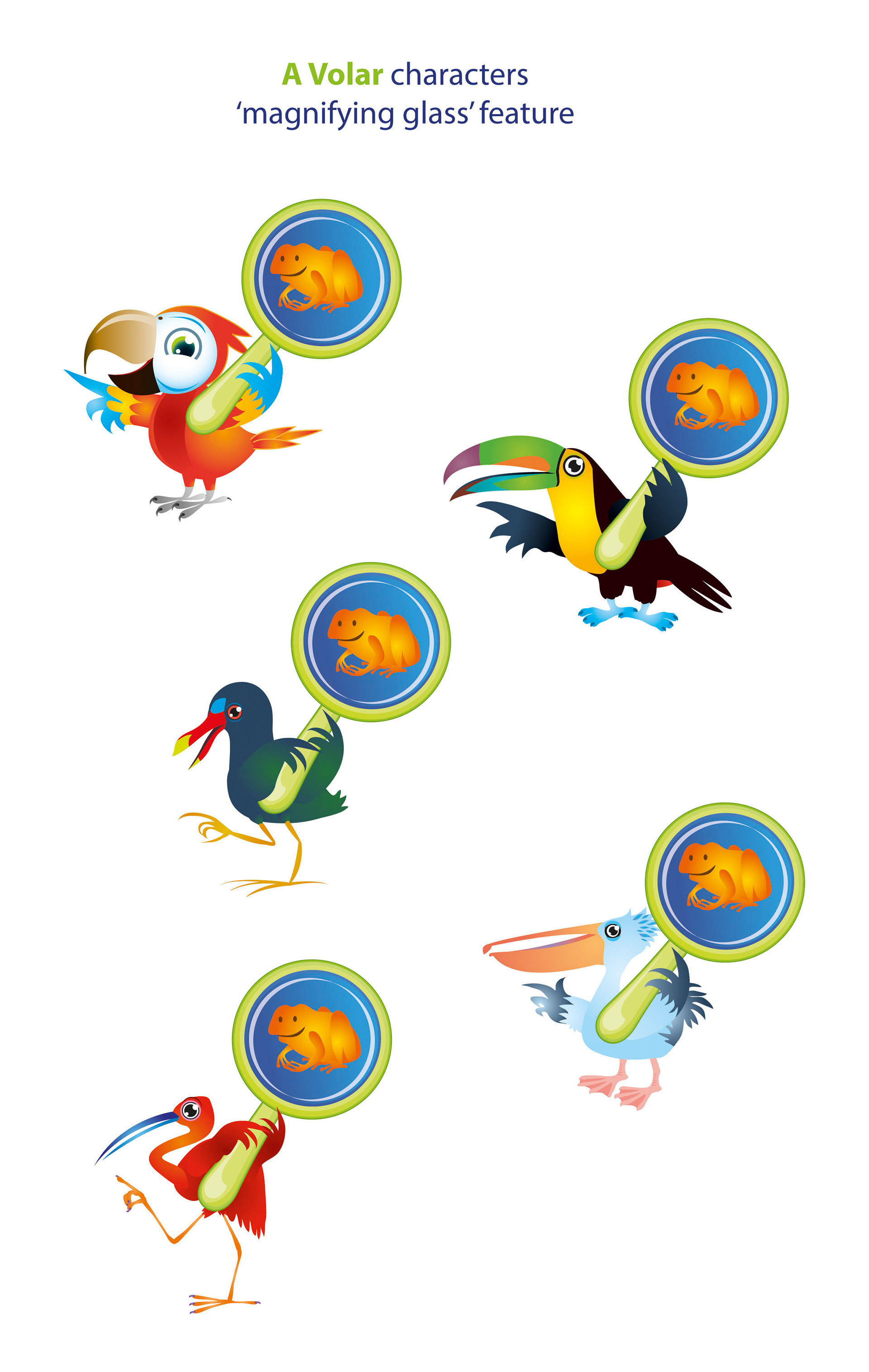
The internal designs incorporating the Series orange and the Year colour (in this case the year 1 purple). page one shows the character holding a magnifying glass. this is a device to show the purples an item that they need to find
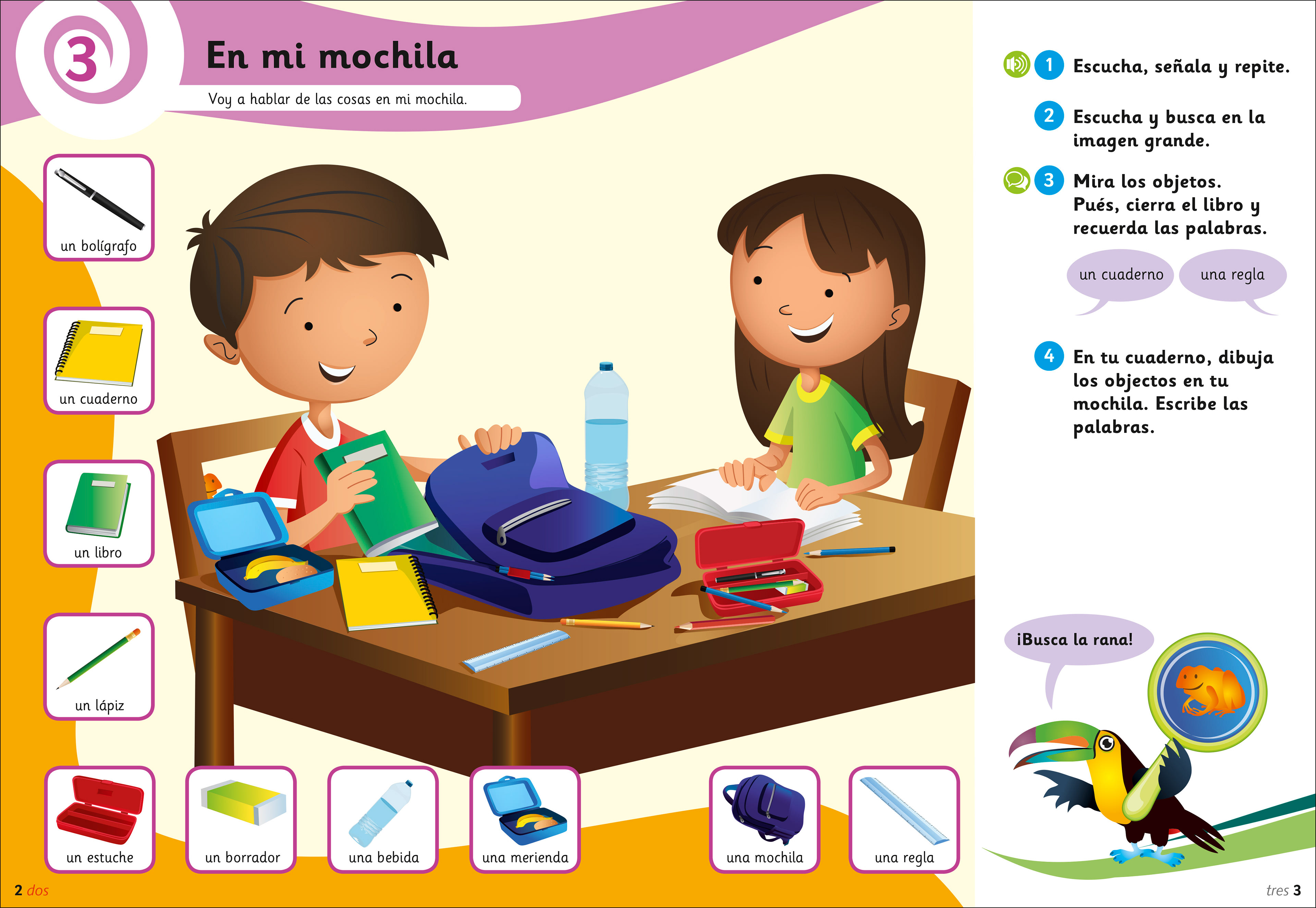

Here are the magnifying artworks for each year.
Series character pencil roughs.
Parrot sketch to final art.
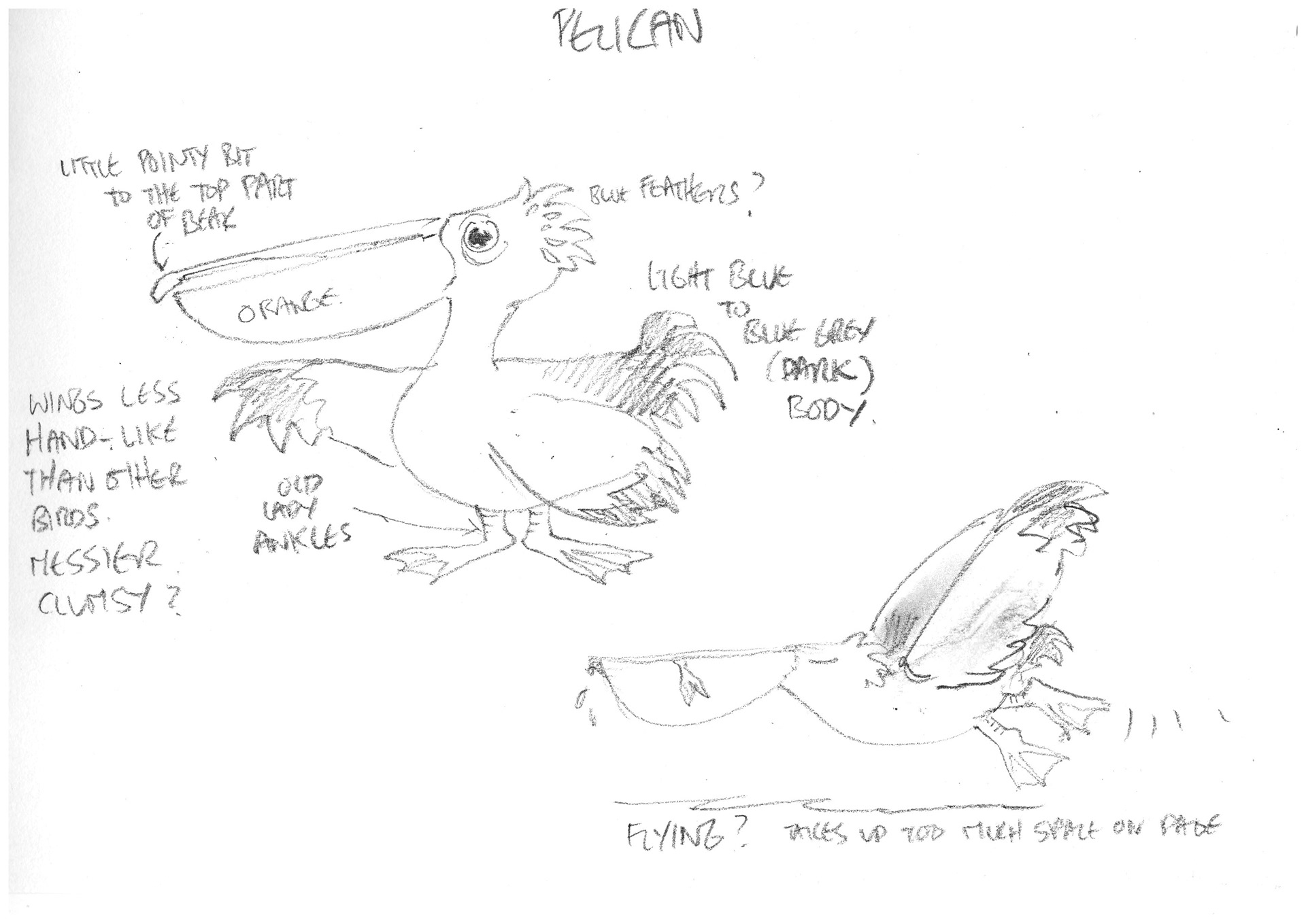
These further sketches helped me find the personality and shape of the characters. I like looking back at my quick notes. I especially like the note for the Pelicans legs - 'old lady ankles'. No offence to old ladies ankles but you get what I meant.
After a few sketches of the Hummingbird I soon realised the complexities involved trying to simulate this hovering bird. I found this would be too distracting for the internals so dropped the idea of using this lovely creature.
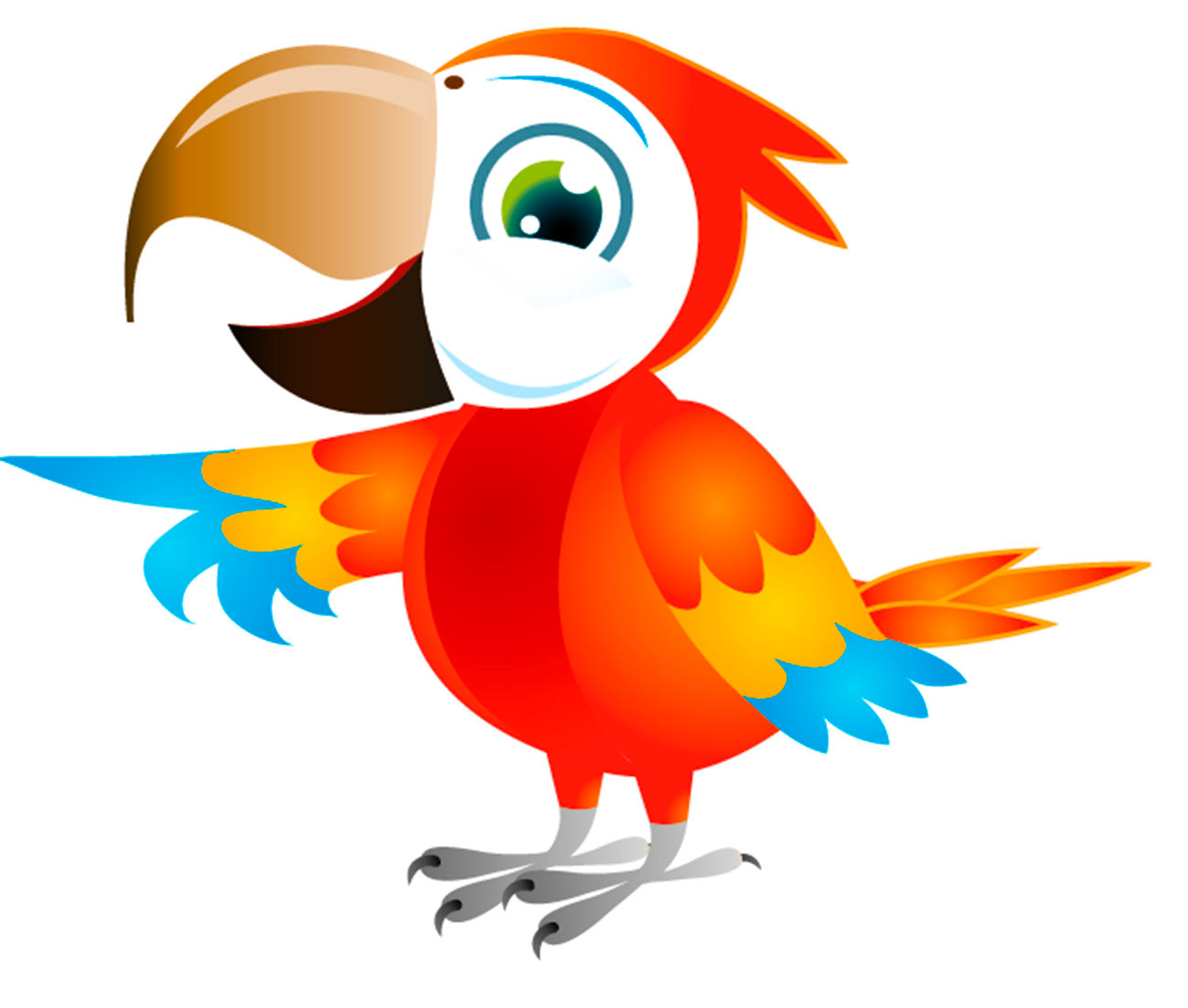
The Parrot page. I initially added the distinctive black stripes to the parrots face. But however I drew them it always seemed to make the parrot angry or surly so they were later dropped for a more open face.
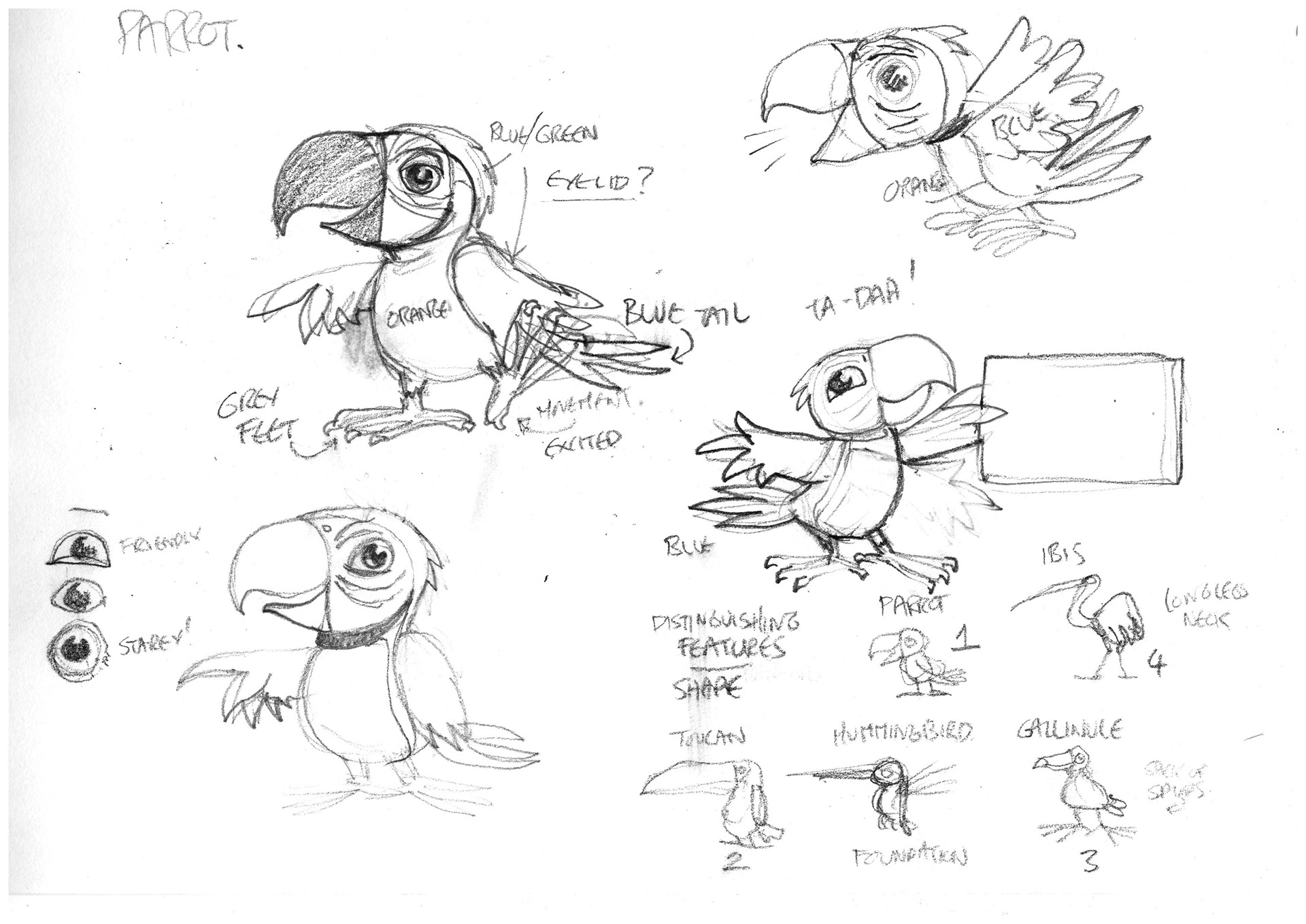
The final Parrot design. It was important to simplify the shapes and detail for the characters. They would be used on cover but also in page and quite small and would look too cluttered and fussy with any more detail.
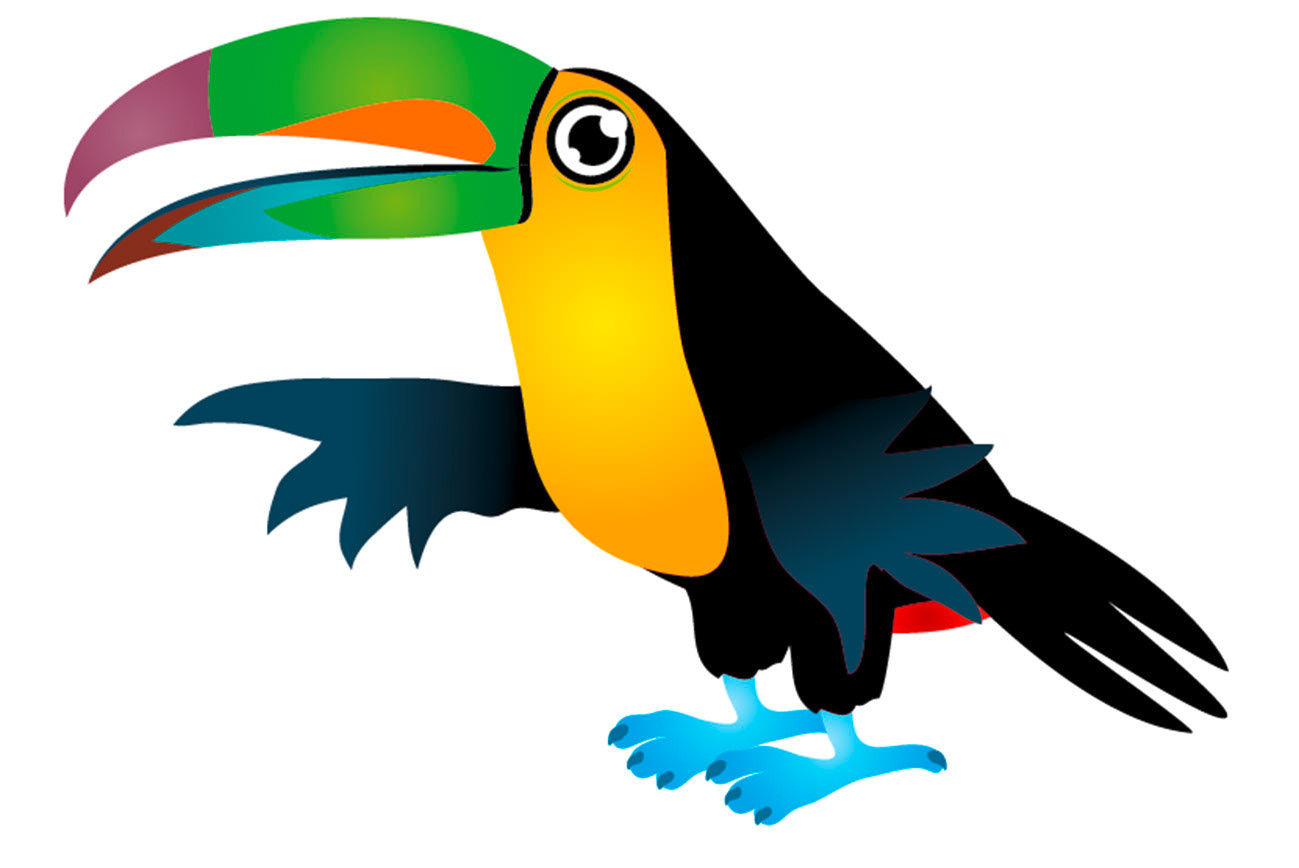
Toucan sketches to final art.
The Toucan was always going to be tricky with that huge beak. Similar to the Pelican I made sure the pelican wouldn't be used for the following title side by side. The monocle was kept in for the 'Vocabulary' section of a spread. This section is a list of Spanish and English words and phrases so I thought it would trigger the pupil into understanding that this was the time to concentrate!

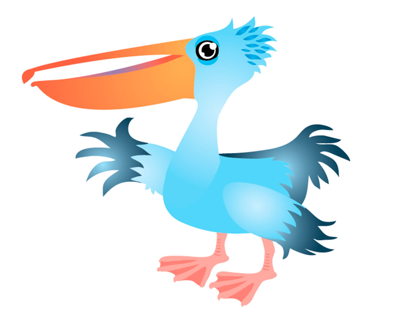
Pelican sketches to final art.
Ah, my favourite. The Pelican. What a character. Old lady ankles. I tried to see if the flying pelican would be useful in page, maybe using the beak to point at items instead of legs/wings, but decided against it as it would take up too much space. I love the head feathers as well. A real messy hair style.
The final Toucan design. Again the note on the previous page describing the toucan's upper legs like 'a pair of old shorts' is spot on.
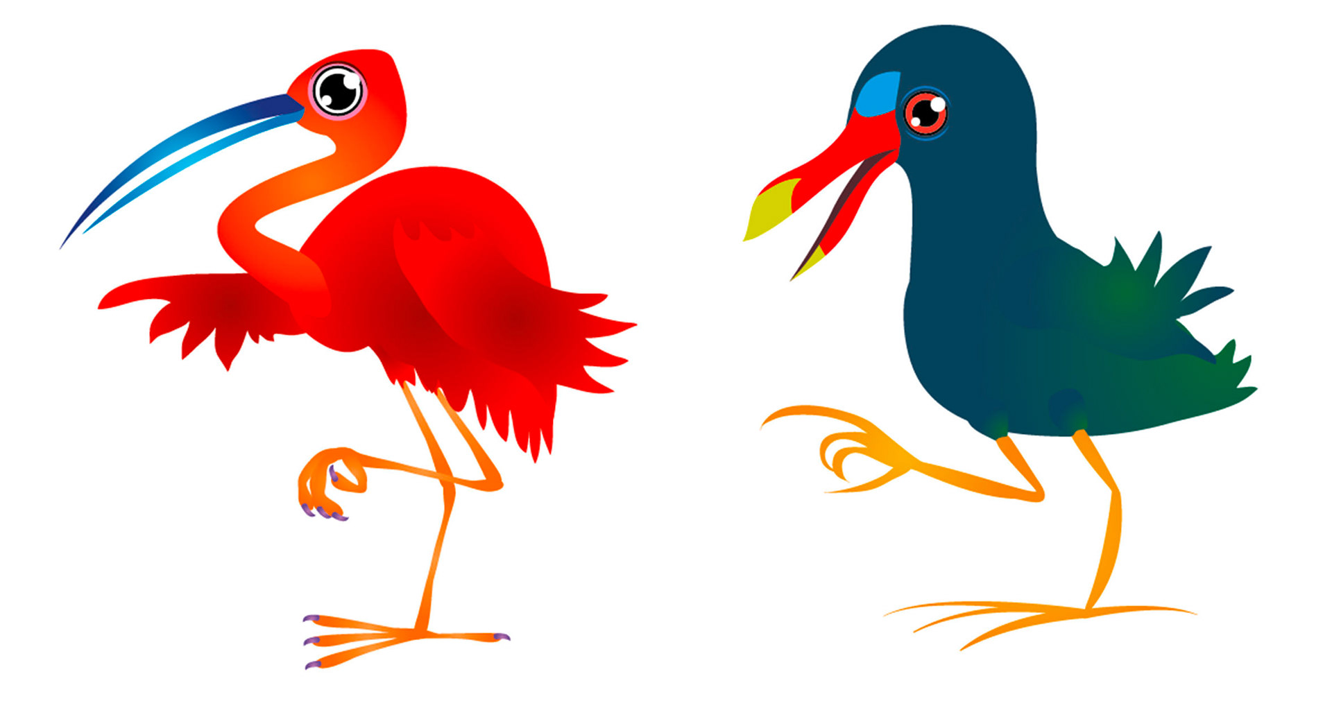
Ibis and Gallinule sketches to final art.
The Scarlet Ibis was tricky because of the long neck. I knew the character had to sit in page and only use the same amount of space as the other birds in the series. I had to find a way to wind it's neck in. When sketching the Gallinule (I know, I've never heard of it either) I soon realised that the beak would be the main part of it's personality because, unlike the other characters, the body of this bird is quite normal and bird like. I also didn't want it to become too cartoony and lampoonish. Started thinking of having these birds pointing at various items in page with their feet rather than their wings/arms.
The colours for these just fell together rather quickly. Love the contrasting beak and body of the Ibis.