
This is the story and processes of creating ideas and sketches up to the final cover design and artwork for my new Picture Atlas for Collins.
I had produced some successful artwork, design, illustrations and covers for Collins Glasgow from 2013-2014 and, in May of 2014, the head designer, Kevin Robbins and the Managing Editor, Anne Mahon approached me to see if I would be interested in being involved in designing and producing the artwork and content for a new Collins Picture Atlas to replace a previous edition.
The older edition used cartographic maps as a background on the page with various Collins stock clipart from other titles. It was felt that there was a lack of consistency of style using detailed maps with various styled artworks for places, animals, etc.. Kevin and Anne thought there was a need to create a new atlas with a strong fresh style for the primary market and designed and drawn by just one person for consitency. I jumped at the chance to produce a whole title by myself.
Below shows the journey of the cover from pencil sketch to launch.
.
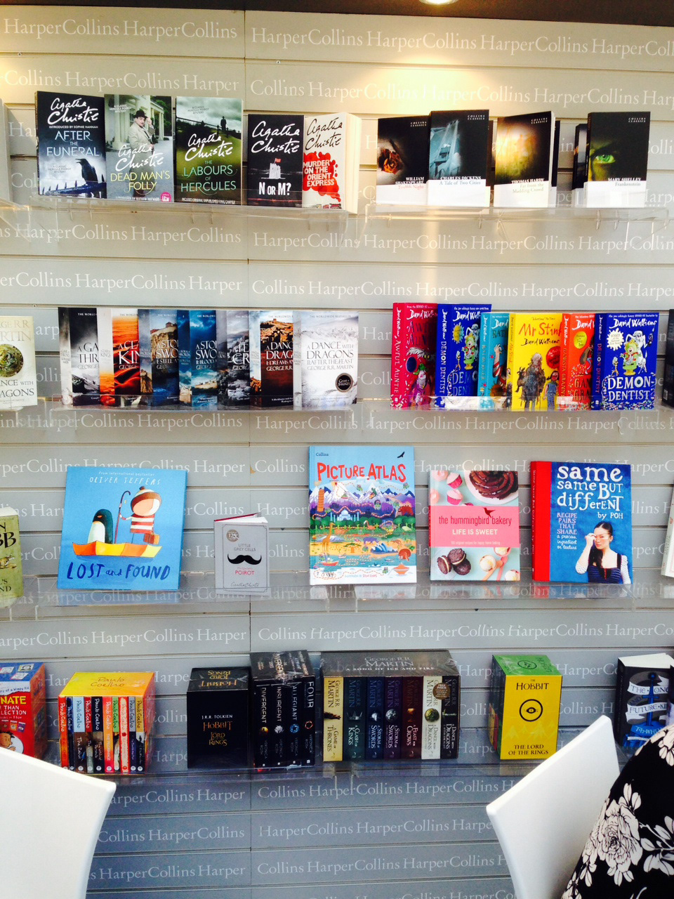
The Harper Collins stand at the 2015 London Book Fair with the printed book in pride of place.
After producing a sample design for the internal pages I then focussed my attention with ideas for the cover design. I first worked up an idea of a small child floating in space looking down at our planet and checking the various continents with illustrations from the internal pages shown.
I produced two rough sketches. I presented them, with two colour visuals to flesh out the look and feel of the background and typography. It was a good start but it was felt that the ideas were too similar to covers of atlases from other publishers already on the market. What was needed was a strong, new individual iconic style. It was also felt that these ideas didn't reflect the style that had been approved for the internal pages. So... back to the drawing board.
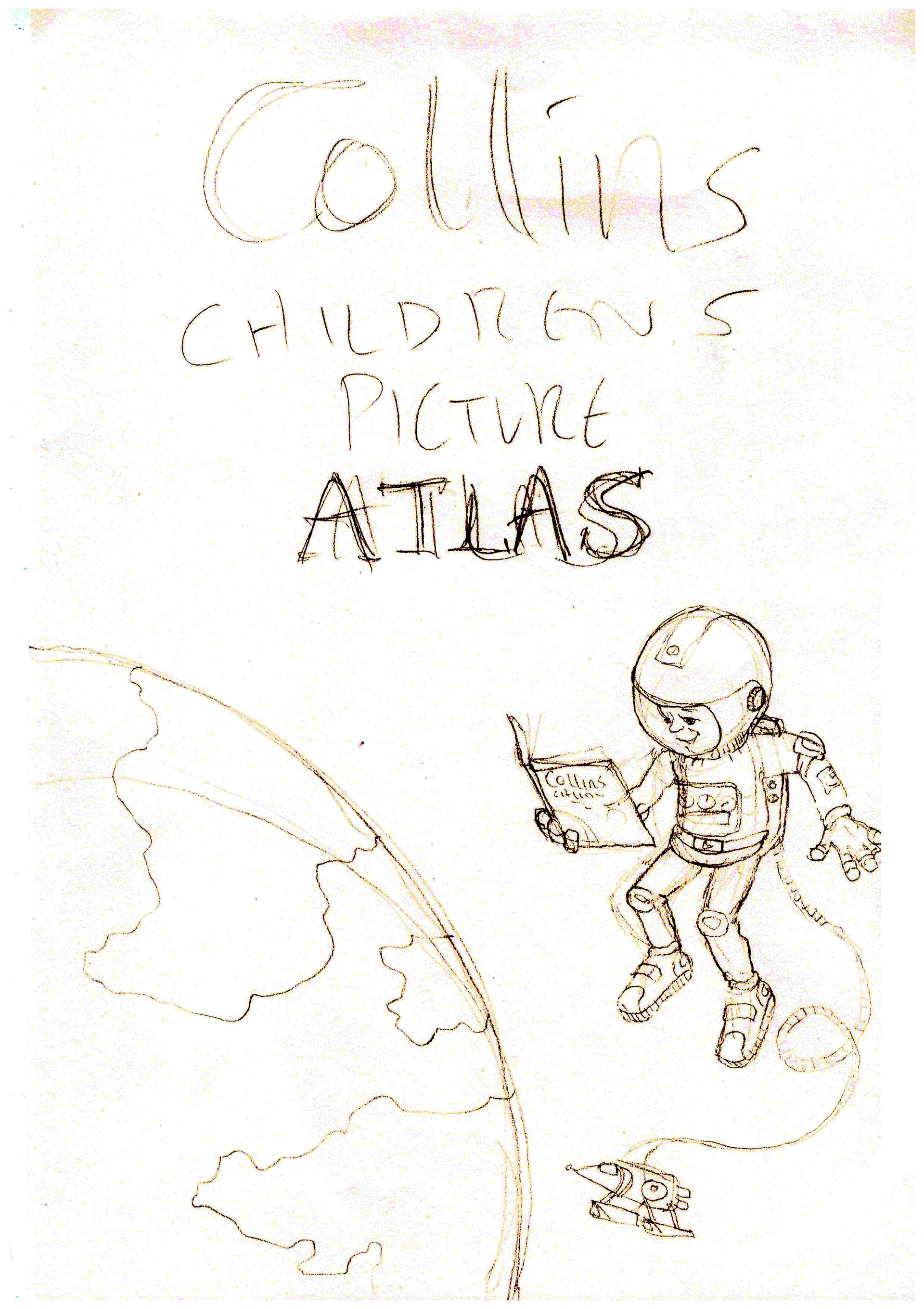
Sketch number 1. A child in space holding and reading the atlas. I have a drawing somewhere that also includes a pet dog with his own space suit on.
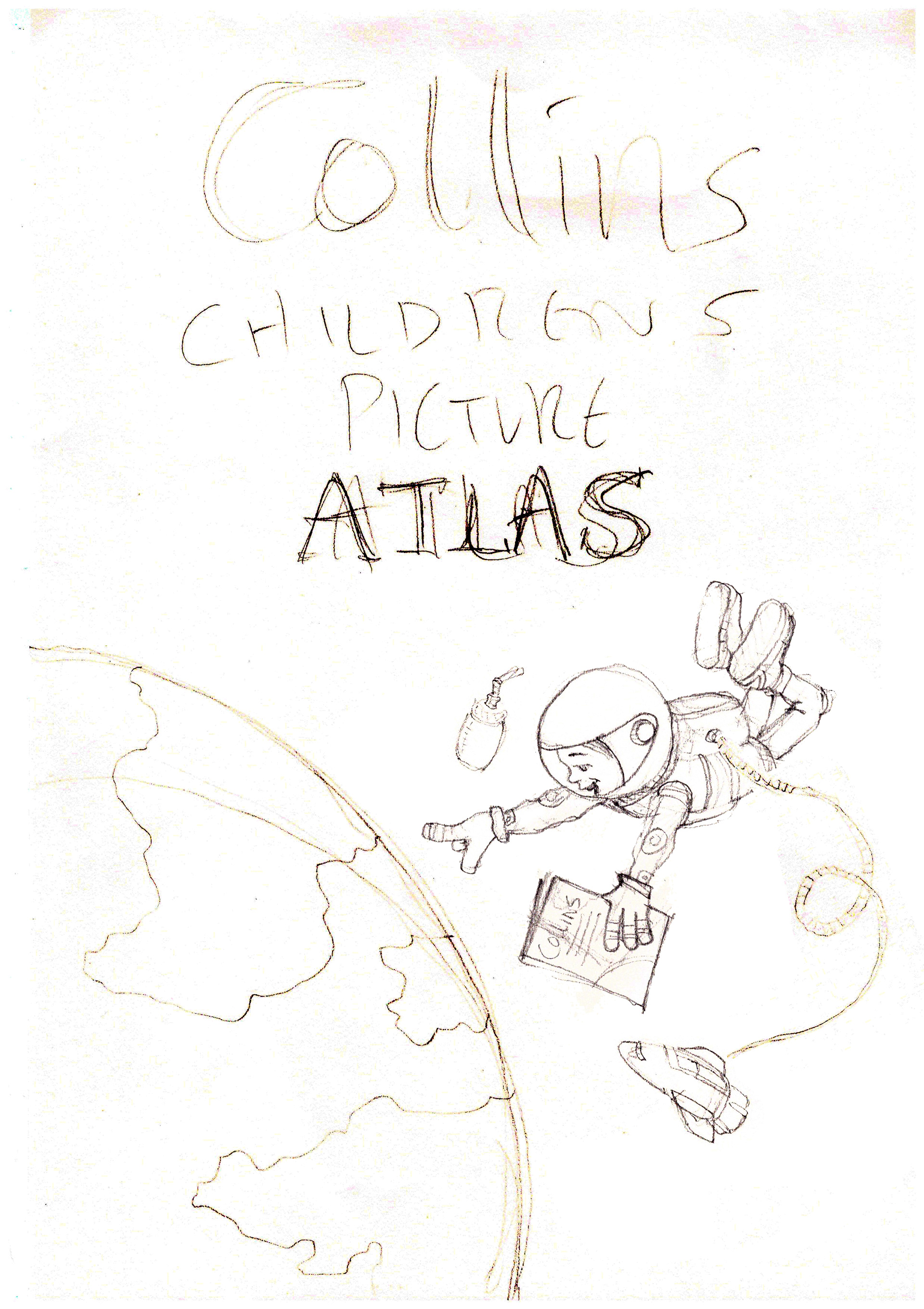
Sketch number 2. I liked the idea of a space suit giving the child an androgynous look so girls or boys could relate to the character. This sketch feels more dynamic as the child is actively pointing to a continent on Earth.
After showing the sketches and the colour ideas (below), Kevin and Anne decided that, to make the atlas stand out from the competition, the cover should avoid having a map or globe as the main image. The sales team at Collins needed a great deal of persuading about this as, traditionally, atlases always, and I must stress, ALWAYS, have maps or globes on the cover.
As this was to be a departure from the more traditional type of early years atlas, there was a need to make the cover exciting and full of energy and to show the diversity of our world. And... to quote the designer, with a slight chuckle, 'No pressure, but we want you to come up with a strong enough identity to take Collins Children's Atlases into the future as market leaders'. A little bit of pressure then.

This first draft has the internal colourful design of the maps with objects from the first sample page of South America.

I produced a second draft to give a variation of how the internal maps could be see on the cover.
I must admit I was scratching my head when the above ideas were rejected as I couldn't imagine what else I could put on the cover of an atlas.
It was the head designers encouraging words to me, 'Just go crazy and draw whatever you would want to see on the cover' that refocused my imagination. The next morning I was driving home, after dropping my partner, Jo at her stables, and my mind was wandering, visualising what I could put on the cover of an atlas that would get the big thumbs up from Kevin and Anne. I gazed at the flat, rolling hills of Dartmoor and started to imagine all of the various parts of the world as a set on the stage of, say, the Muppet Theatre (stay with me). I imagined various parts of the globe; deserts, swamps, seas, savannas, etc. being put together as flat boards layered behind and above each other. Each horizon dividing the other. Goggle eyed indigenous animals from each of these regions would hold up their own part of the set with their claws/hoofs/wings. A variety of famous buildings could be scattered around the scenery adding to the global feel. Below is the sketch I quickly put together as soon as I got home, scribbling quickly, scared that the idea would escape me before it was solid on the page.
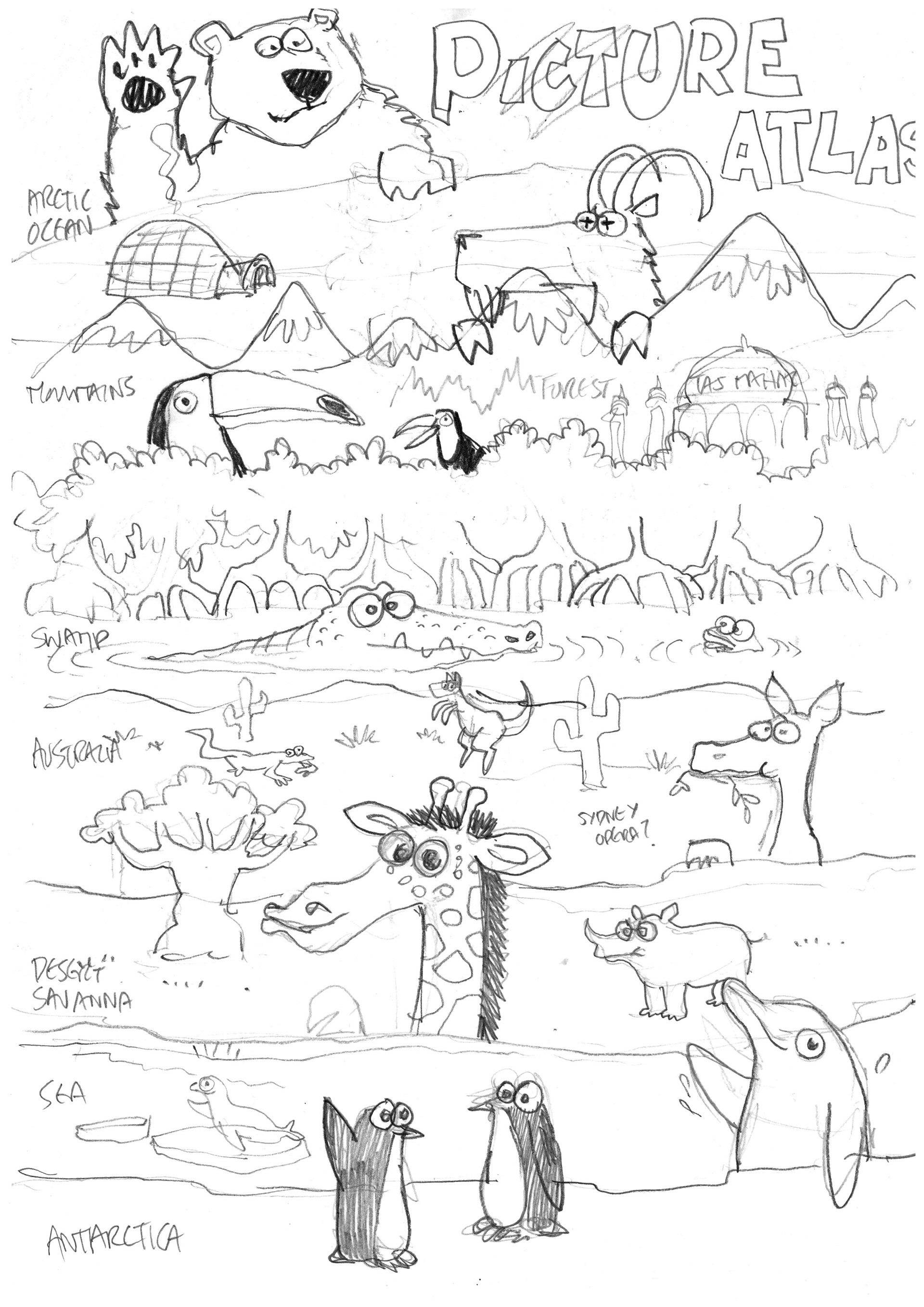
The first quick sketch which I threw onto the page as soon as I reached my studio. From penguins to polar bears.
The reaction from Anne and Kevin was fantastic! It was unanimous. This was it! They loved it and felt that this was a great direction to carry forward. The idea needed a lot of work and tweaking but they were happy with the idea. I felt relieved that I was on the right track. Anne felt that the animals, maybe, took up too much of a focus and made the cover look like something you would find more for a nature title not an atlas. The focus needed to be more on landscapes and landmarks.
I created the sketch below and quickly emailed this to the team before starting on the more detailed work. Just to double check that this was the right direction to move in. What would be the final look of the cover was slowly coming together.
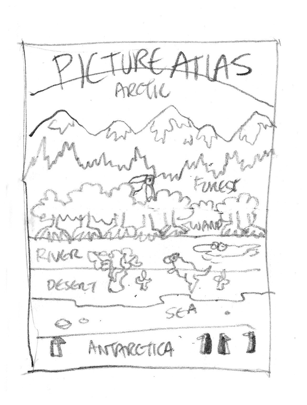
This was a cleaner sketch making the environments the dominant focus.
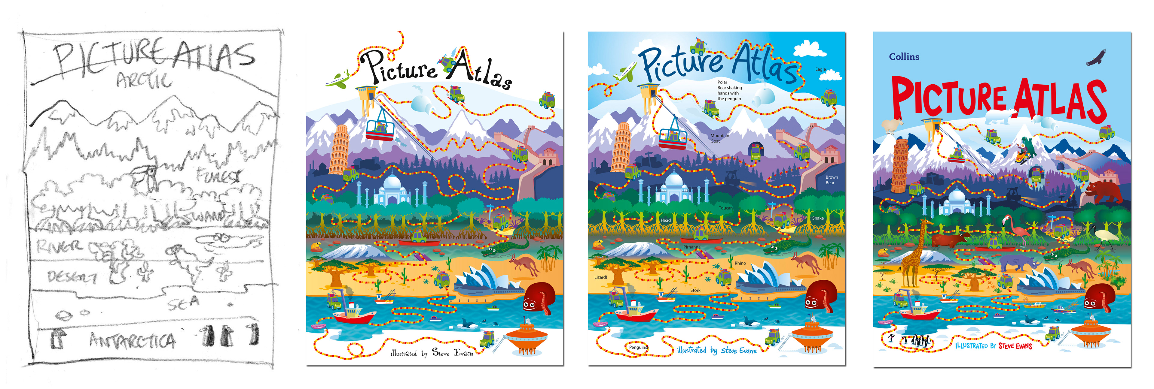
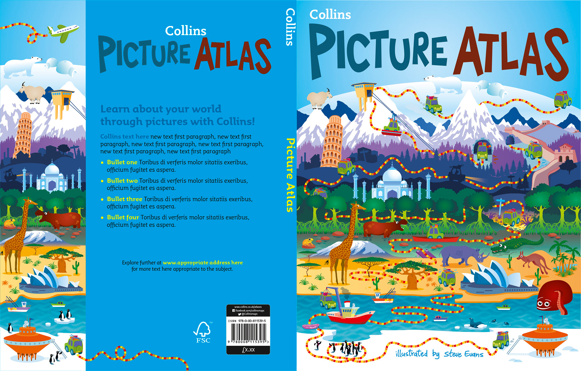
Below is the first detailed design with most of the final elements in place. After first drawing the scene, I felt there wasn't a starting point for the viewer to begin looking over the various landscapes. It needed something, a guide to lead the viewer across and up the cover.
Thinking of the Indiana Jones films and the device of using old maps and a dotted lines to show the main characters journeying across the globe, I envisaged a vehicle doing the same thing, weaving it's way through the landscapes, meeting objects and animals on it's way. This is when I introduced the little green 4x4 car (probably a Landrover, my favourite car company) to create the narrative.
Anne had loved the stripy line I had used for the internal map design. She wondered if I could incorporate it somewhere on the cover. Well, I did that alright! This first design, below, show's the journey the car takes from a scientific station in Antarctica to the far north of the Arctic Ocean towards the title. The font used here had been used for another title and Collins initially liked the style. But then Kevin wondered if it would benefit the overall design if I created a bespoke text style to go with my design.
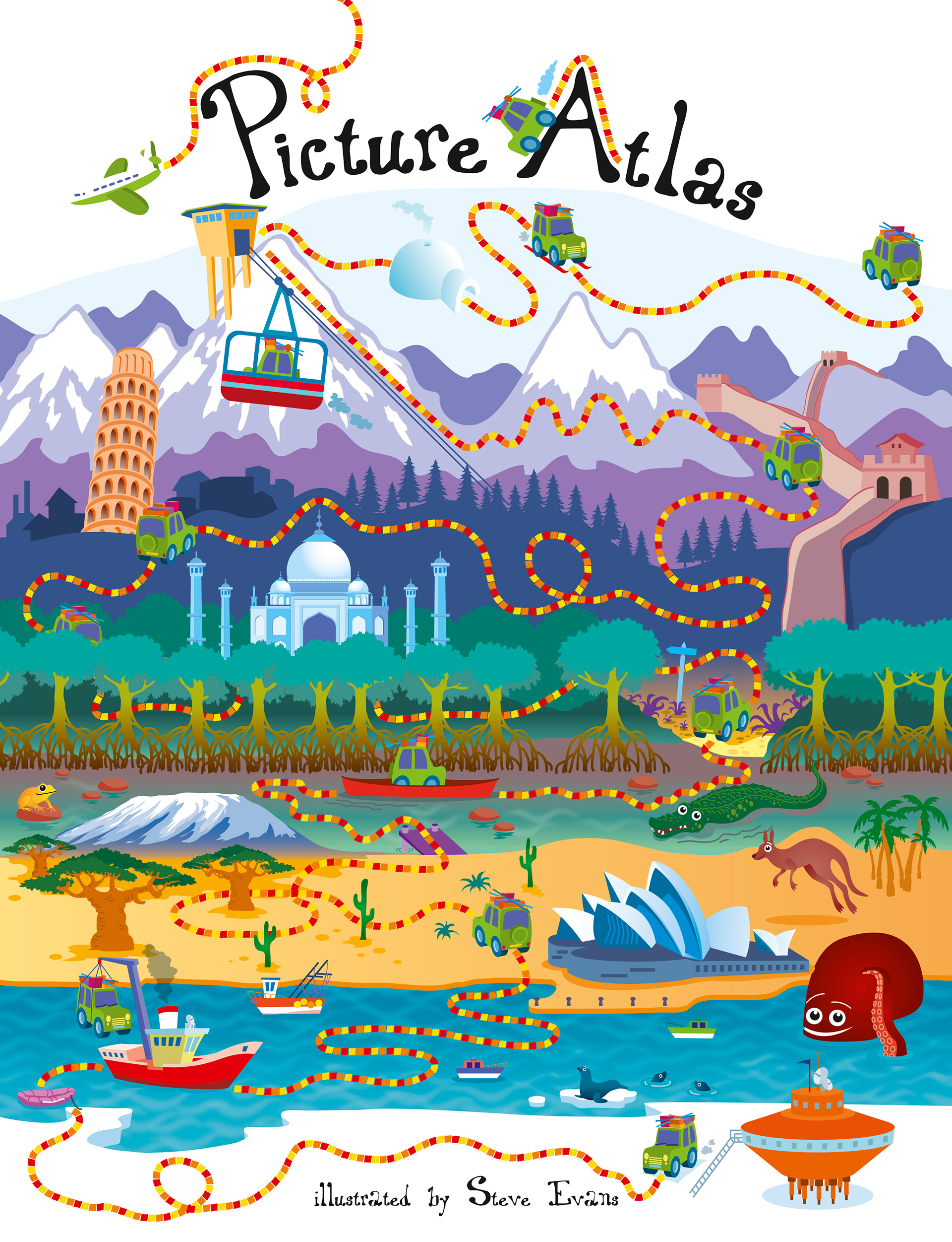
The first design showing the car's journey north. I saw it as a, sort of, 'Around the World in 80 Days' kind of journey. The car doesn't just drive to his destination. he travels by cargo ship, across the desert, then canoes along a swamp and even travels up a mountain in a cable car.
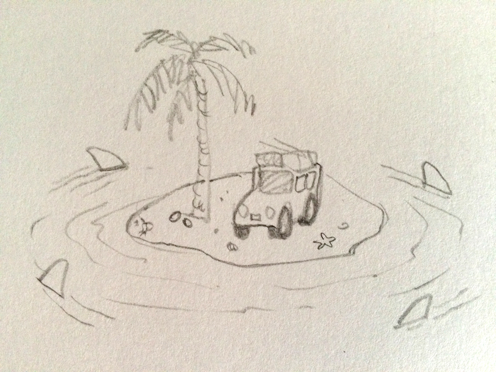
... and here is the first ever sketch of the little green car on a perilous island.
Below is my first attempt at creating a hand drawn title. I felt, overall, it was really starting to come together. the aeroplane was later removed as it didn't add anything to the story and, it was felt, would confuse the reader's journey on the page. There are notes written on the artwork of other elements that I thought may be added later.

I added the car travelling at night (below the mountains in the forest) to give the feeling of a long journey that the car is taking through night and day.
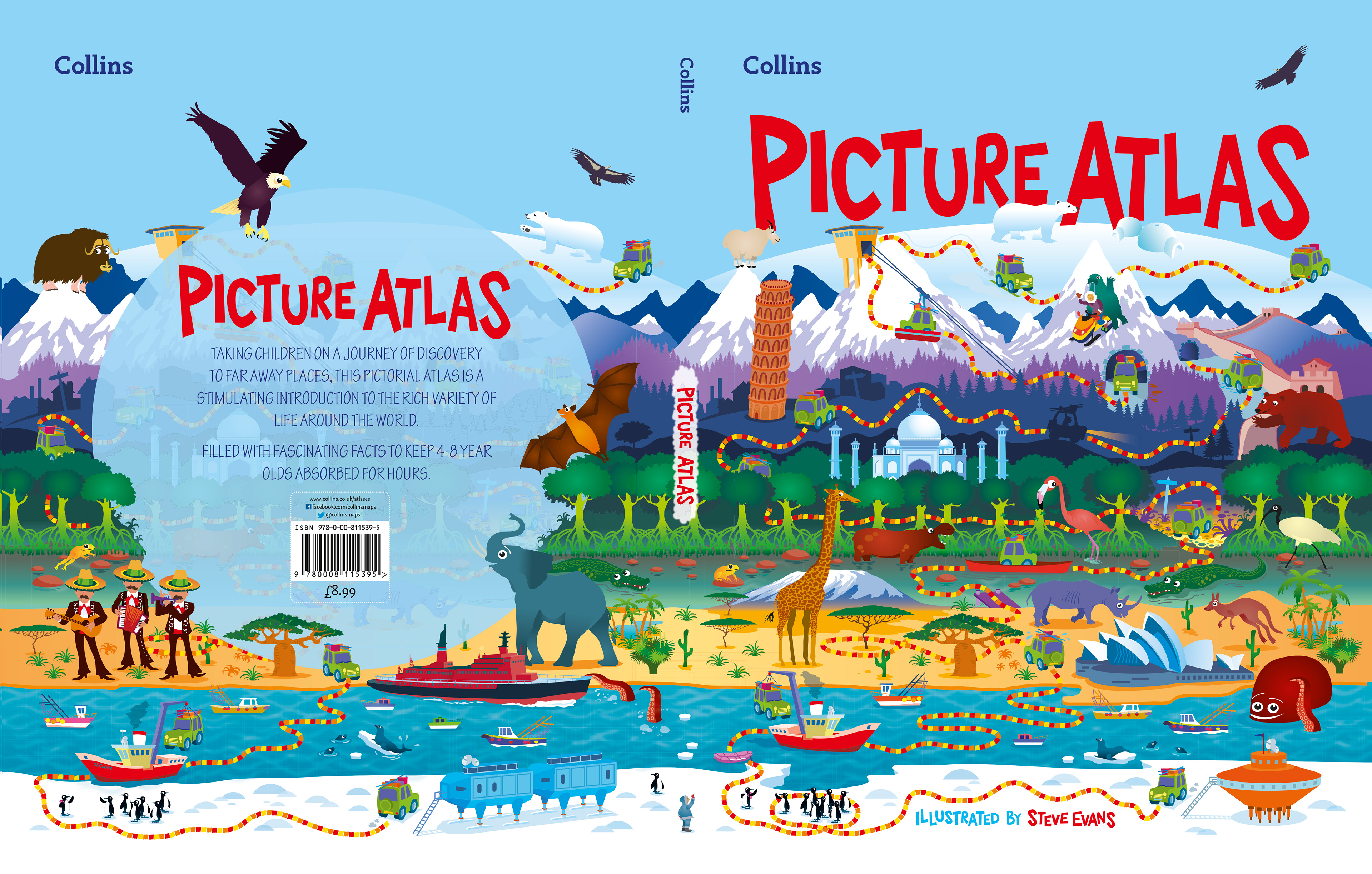
After much tweaking and reworking, the final design was complete. I was very relieved that it was finally finished and approved. It had been an amazing artwork to produce but very time consuming. Maybe now I could concentrate more on the internal pages. But Kevin reminded me that a back cover would also need designing too (!).

The final front cover.
Here is my first idea for the back cover. I pictured the cars journey climbing up a narrow column on the left of the page. While the introduction, barcode and other information would sit on the right of this. Kevin felt that it looked too conventional and asked me if I could try and include elements from the front onto the back page as one continuous panorama. The title and intro text were placed within a circle with elements from the internals placed around to soften the edge. In retrospect, that blue band does look a little too imposing.
... and here is the final front, spine and back. If you look carefully you can see a man waving to the penguins from the base of the spine. This small artwork replaced a penguin I had drawn there originally. Kevin and Anne, with some humour, thought that the penguin was in exactly the same place that the publishers 'Penguin' put their famous icon. Oops. I very happily replaced it.
The back cover continues from the front. It gave me a chance to show the cars return journey to the south, not to the original scientific station but to another one. I later added some artworks from the finished internal pages including the African elephant, Mexican Mariachi Band, eagle and yak to mention a few.
I am very proud of this cover. I felt I was part of a very strong team, with Kevin and Anne with their guidance and experience on this project. Lovely people to work with and very supportive too.
The book was well received on it's launch on the 21st May 2015 with it's accompanying World Map being a bestseller on Amazon since launch. A map of the United Kingdom and Ireland was to follow and then a whole series of Collins Children's posters (See other entries in the portfolio).
The cover was also made into an interactive web page. It was fantastic to see the cover animated and the little car going on his journey north.

From sketch to final art.
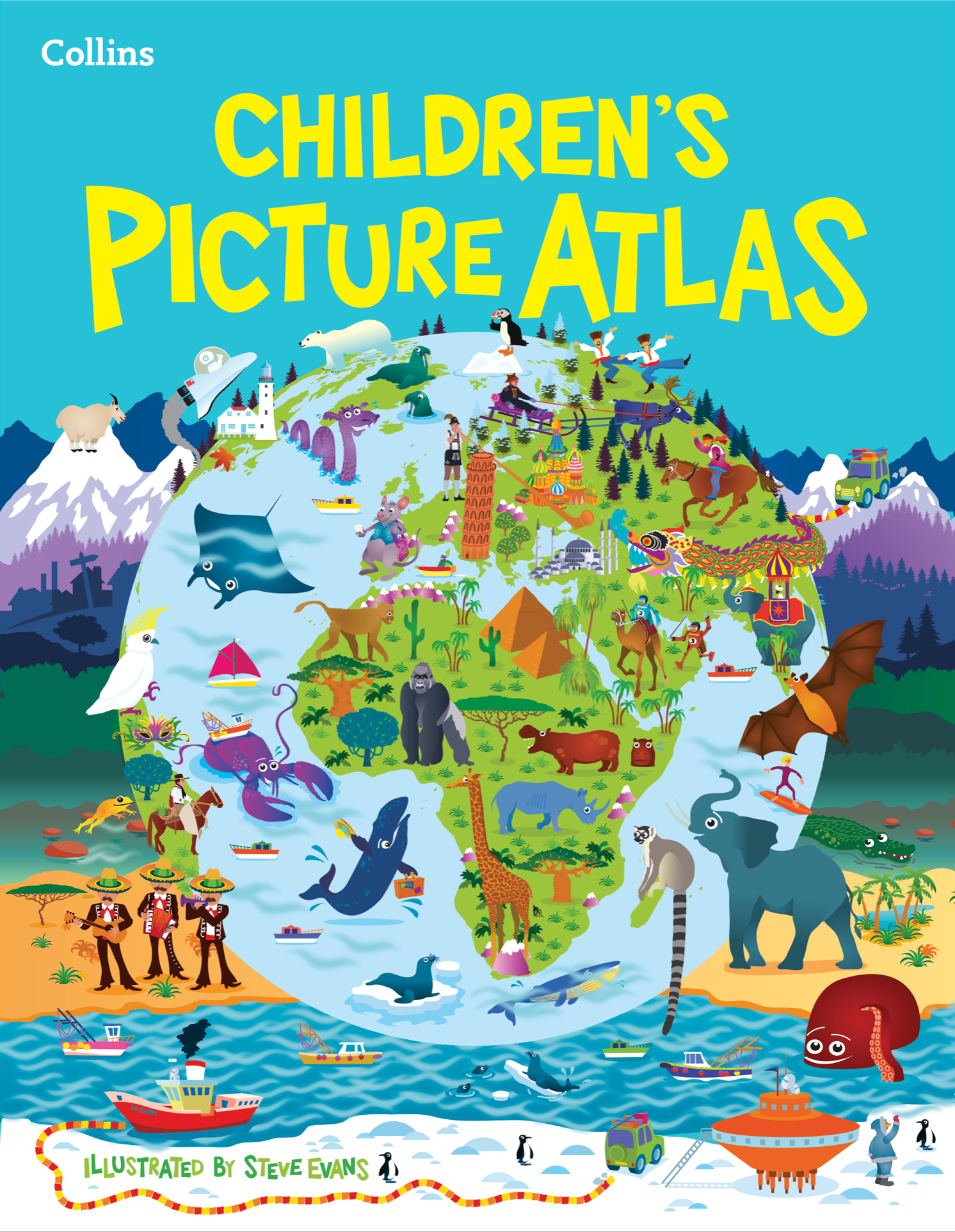
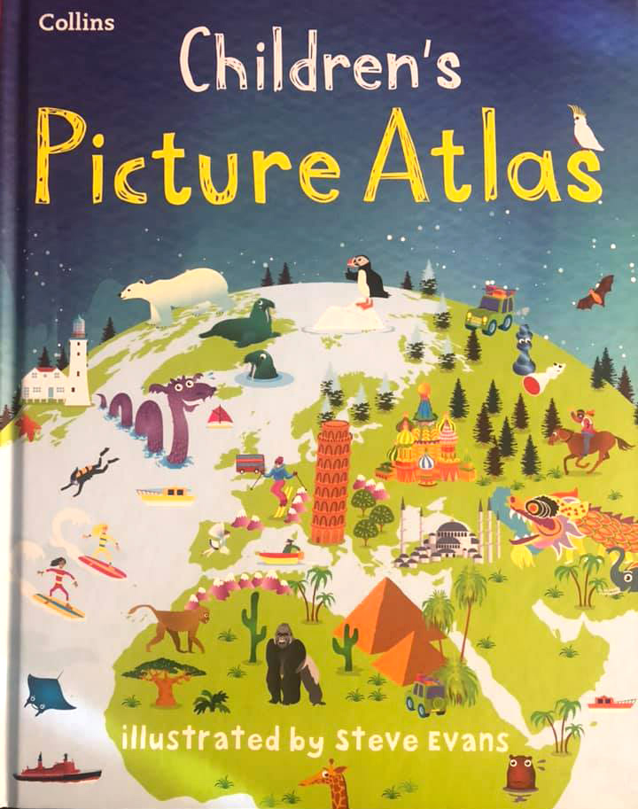
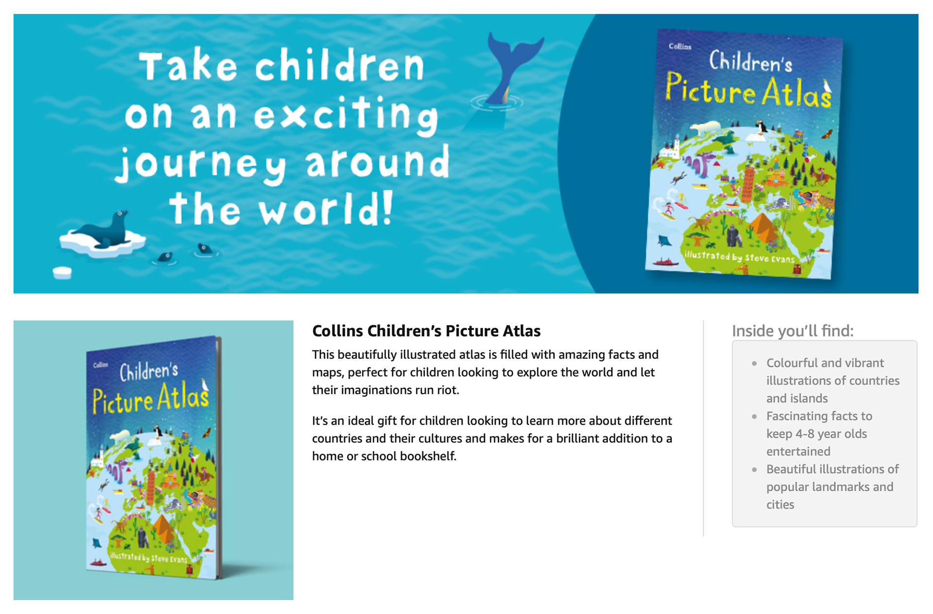
In 2018 I was commissioned to redesign the Atlas cover. The brief, to reimagine the design and include a globe (yes, the sales team had won out in the end). The buyers at Collins had researched that the market would more easily see the book as a more traditional title for their children with a globe included. The title was also renamed as Collins Children's Picture Atlas. I also included internal artwork from relevant countries.

In 2019 the globe was given even more prominence on the cover.
Here is a link to the Harper Collins webpage with links to my World Map and other educational posters. https://www.harpercollins.co.uk/9780008320324/collins-childrens-picture-atlas/

Since launch in 2015 the Atlas has remained number 12 bestseller in the Amazon Historical Atlases and Maps section. The World Map remaining in the number 1 slot.
