Client: Harper Collins.
Brief: To create a striking illustrative style for an audiobook series.
Brief: To create a striking illustrative style for an audiobook series.
This is the original proposal for the art style.
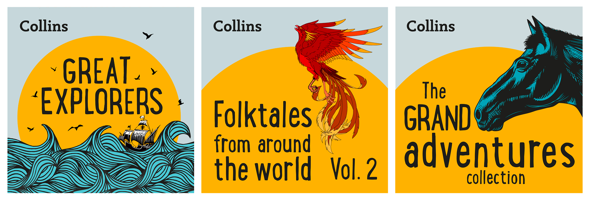
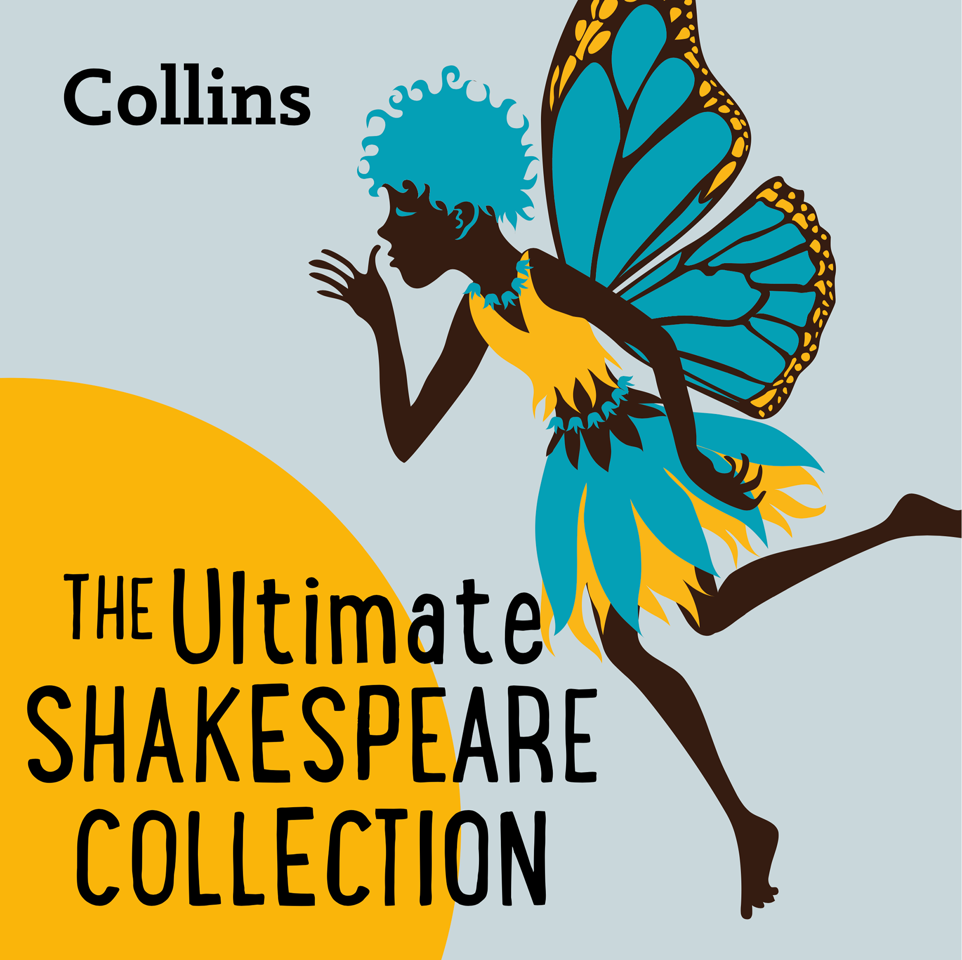
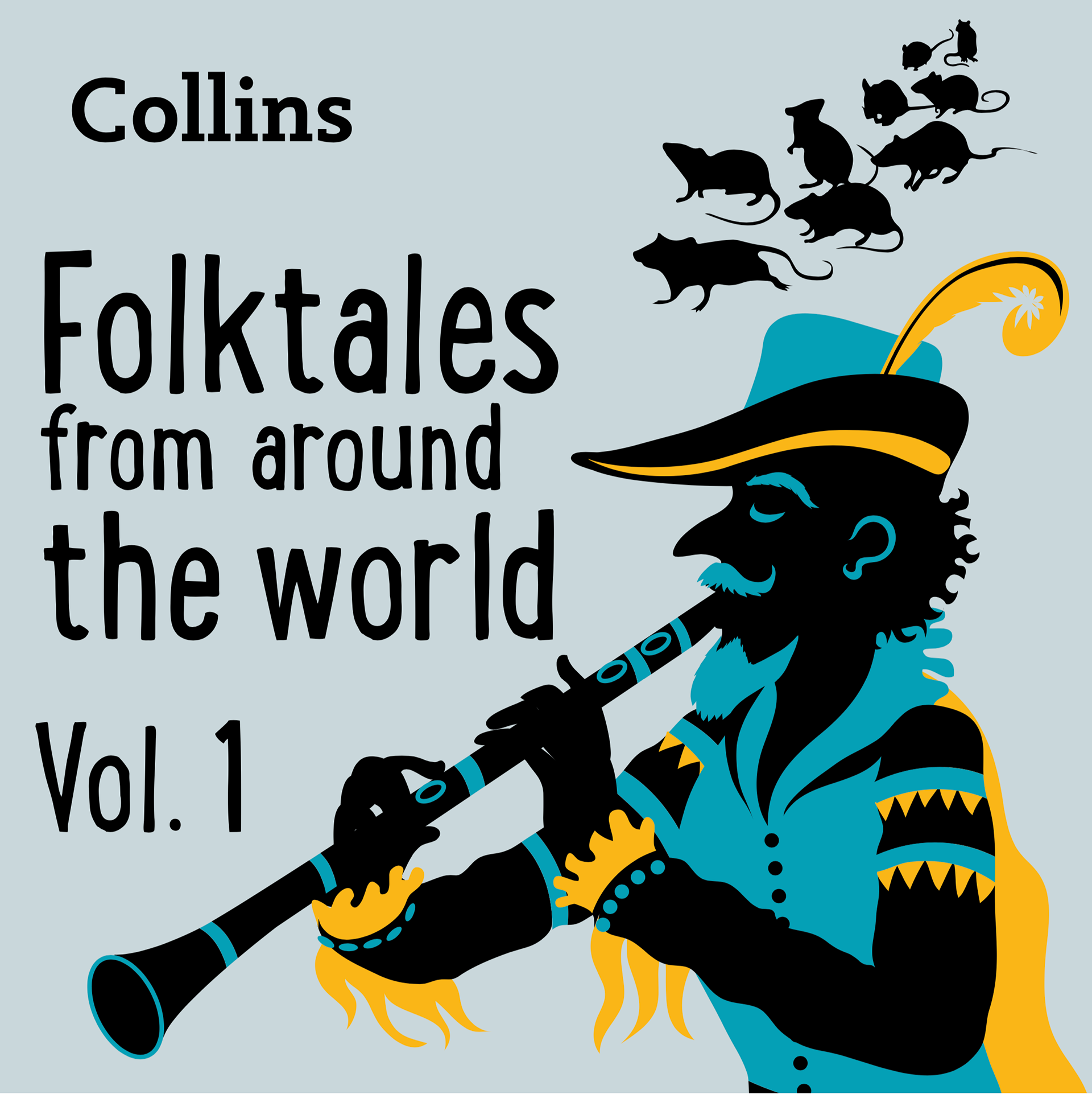
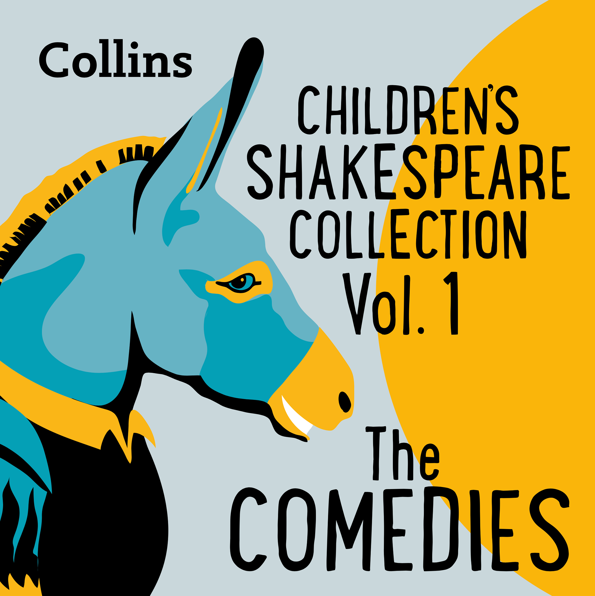
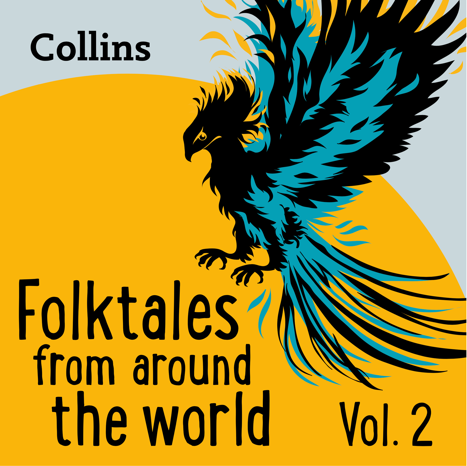
I restricted the colour swatch to four colours, yellow, teal, black and a muted grey background. I continued the yellow circle as a series identity throughout, apart from 'Family Classics' which needed a background for the hurricane, and 'Our Amazing Planet' which I needed to use the yellow for lava.
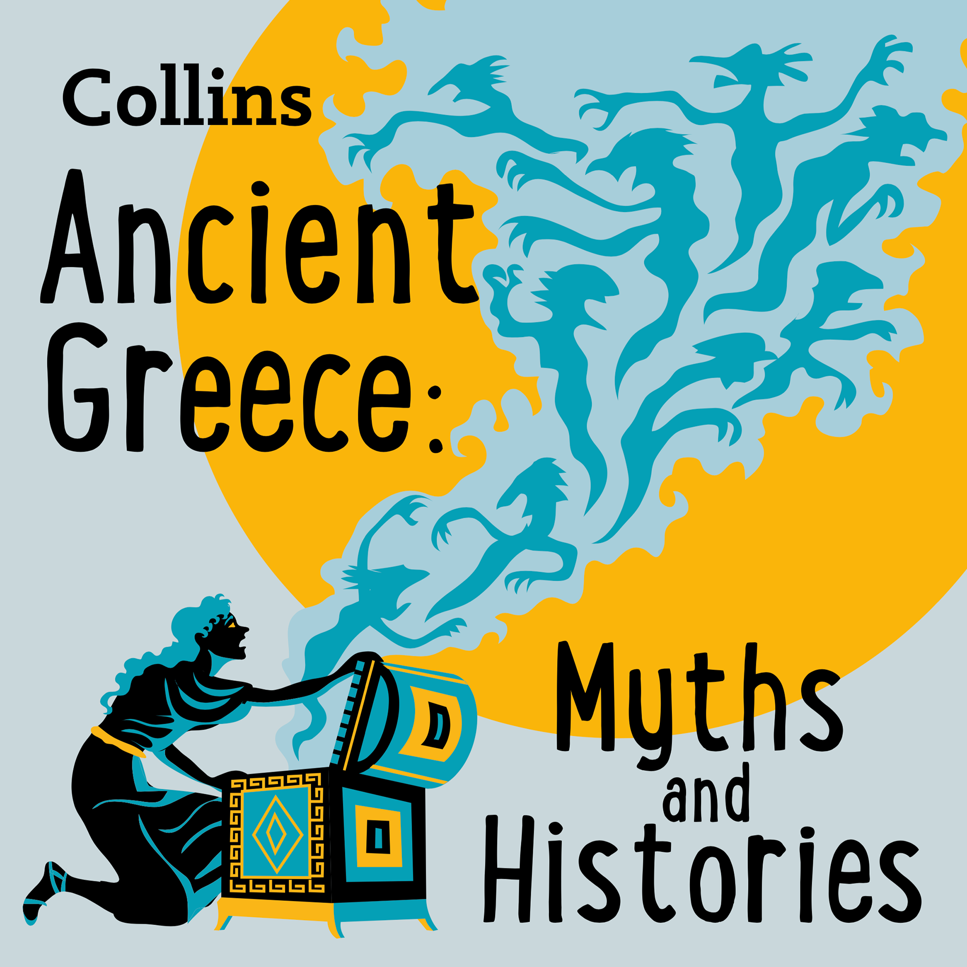
With the first proofs I included two ideas for the 'Children's Gothic Horror Collection' as I was aware that the first idea may be too mature or dark for the age group. Although still imposing, I felt a crow in a tree less threatening than a haunted figure. I was surprised how little changes were made to the initial designs. Just a few tweaks to the text.
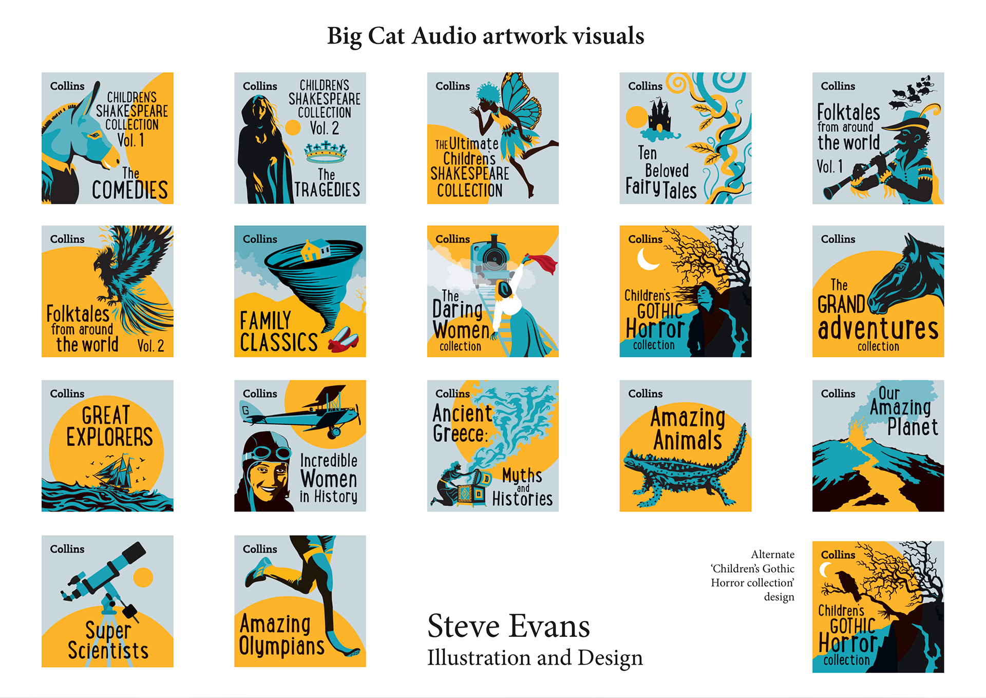
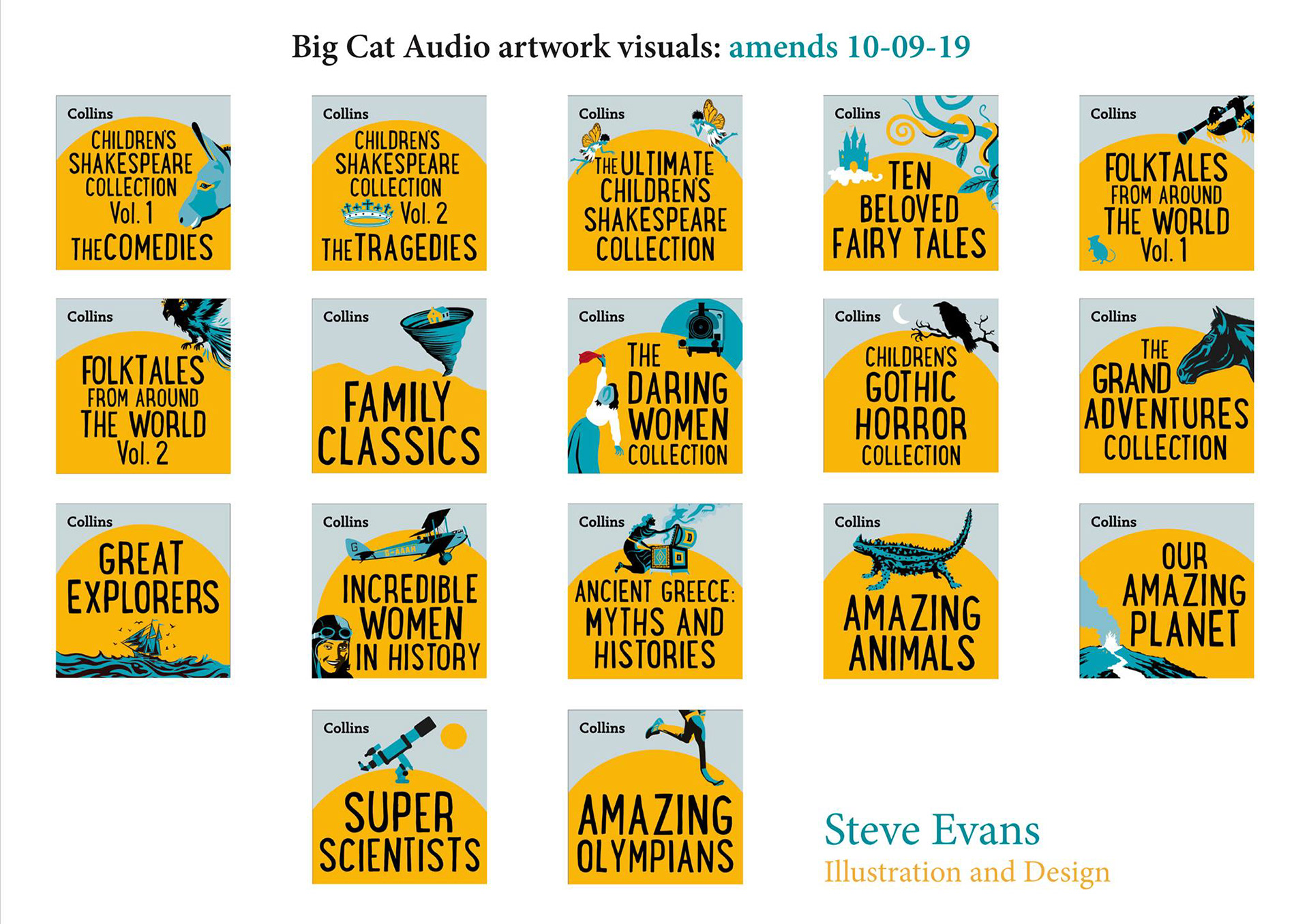
After further discussion, the publisher and editors decided that, as the covers were also to be used as thumbnails online, there was a need to give more emphasis on the titles for clarity. This unfortunately meant that some artwork detail would be taken out. It was a challenge, but I think the covers still have the spirit of the original art condensed down. I utilised the yellow circle further for uniformity but still kept the terrain for the 'Family Classics' cover.
I'm still pleased I got the chance to create the more detailed artwork for this series. I received great feedback for this series from different departments of Harper Collins.